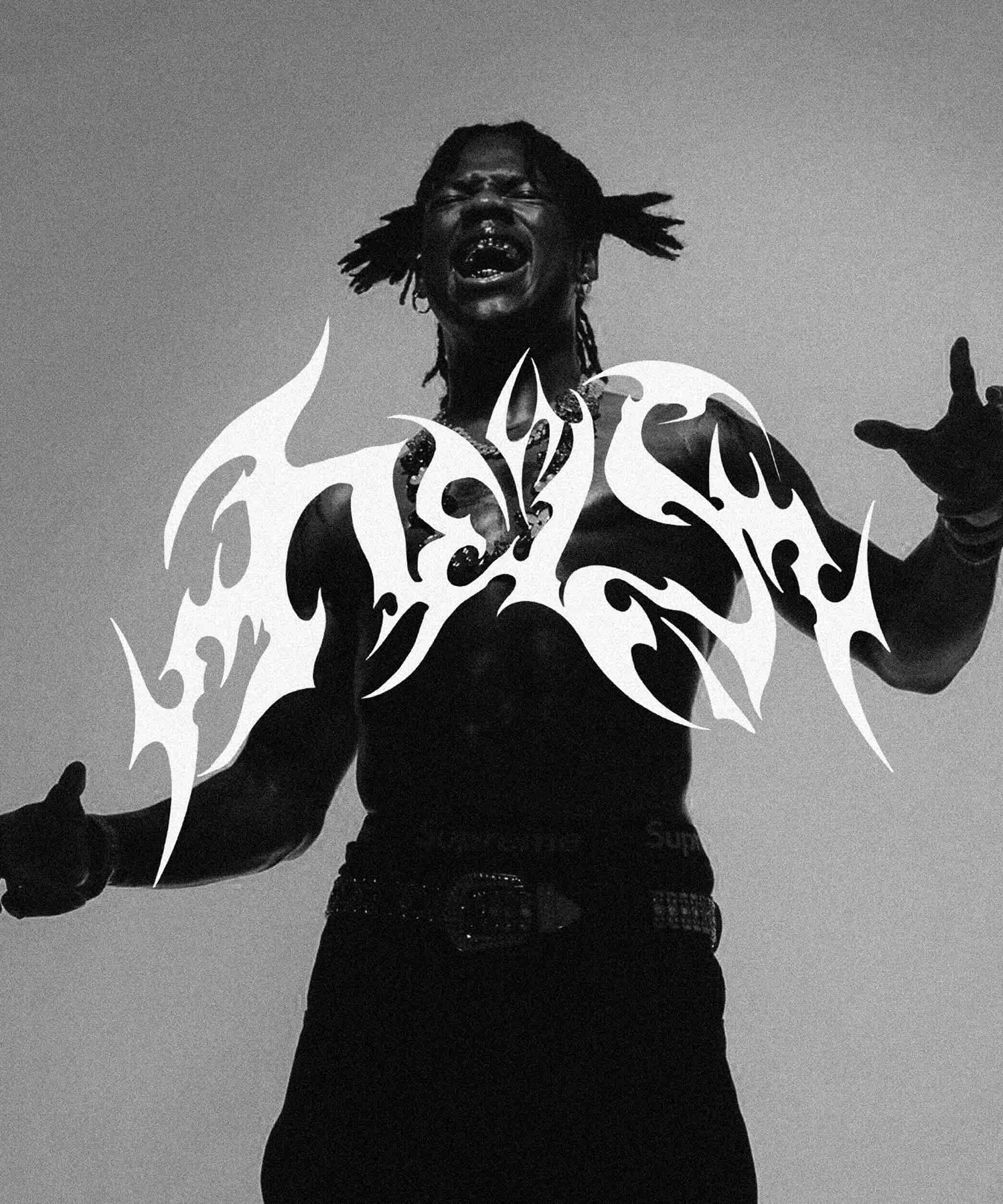
Rema is a global artist whose work continues to shape contemporary sound and culture. Studio Unruly was commissioned to design the logotype for HEIS, an album that marked a clear shift in Rema’s creative direction. The task was to create a symbol that could carry the weight of a new era, not just as a title, but as an identity.
HEIS represented a transition, bold, self-assured, and forward-looking. The challenge was to design a mark that could signal this evolution without over-explaining it. The identity needed to feel intentional, timeless, and confident enough to stand on its own across artwork, performances, and cultural conversation.
Studio Unruly approached the logotype as a standalone symbol rather than a decorative wordmark. Drawing from the bat bird, a recurring motif Rema was becoming associated with, we developed a mark rooted in presence, mystery, and vigilance. Referencing his origins in Benin City, the symbol was designed to feel grounded yet otherworldly: watchful, controlled, and unmistakable.
The result was a restrained visual identity that could carry HEIS as both a name and a signal, one that felt native to Rema’s evolving image while remaining timeless across album artwork, performance, and culture.